Friday, 8 March 2013

Evaluation: Double Page Spread Analysis

1. In what ways does your media product use, develop or challenge forms and conventions of real media products?
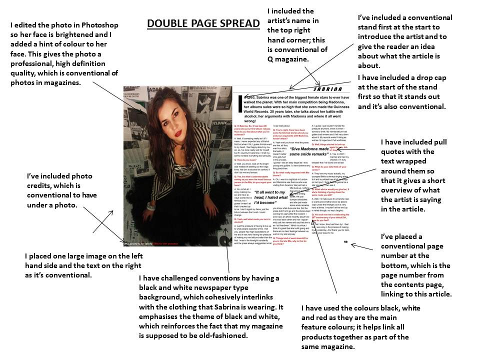
 
 
Overall, my double page spread includes many conventional features, but it also challenges conventions too. I have included a high quality photo taken with a high quality camera, as magazines tend to have high definition photos that look very professional. I've placed the image on the left page and the article on the right, as that's also conventional of magazines. On the front cover, I advertised a timeline of the artist's life, which would appear after the interview on the next page. I placed the conventional photo credits at the bottom of the photo to display who took the photo and the source (from her original album promotion in 1993). I've challenged conventions by only including one picture, as I found during my research that some magazines have more pictures placed around the article. It's also rare to see the artist's name at the top of the right page, as usually they are in large print either across the image or before the article, as a masthead. However, I saw that Q magazine sometimes place the name in small font as they know that the audience would know who they are anyway (image on the right).

I made the choices I did because I wanted my double page spread to look like part of the same magazine as my front cover and contents page, so I used the same colour scheme; red, black and white, which creates continuity and shows a conventional "house style" rule that magazines tend to follow. I tried to make my double page spread have a simple layout, so my audience would be interested in reading it; the photo that I have used has the same newspaper background as the other photos from the front cover and contents so that the audience know it's the same person and it's consistent. This pose is very different compared to the other two; she looks more innocent in this photo with a high angle shot, which links to the article as it's about her cracking under pressure, so it shows her vulnerable side. Also, she doesn't have sunglasses on in this photo, which suggests that we are "getting to know her" which is what the article is about, as though she's revealing her personality and we see her for who she really is.

However, if I was to create it again, I would maybe include a pull quote going across the image as that way, it would encourage the audience even more to read it. I would also include more images in the text as that way, it would attract the readers more because if the audience is young people, then they would probably prefer to see more pictures.


My first hand drawn draft was very basic. I placed the masthead on the left, going above the photo as that was my idea at the time. I also wanted to include a pull quote, but later changed my mind, however I would include a pull quote if I was to do it again. However, I stuck to having columns, a stand first and pull quotes as that is conventional of magazine articles. However, in my first draft, I was going to advertise what was on the next page at the bottom, which is an idea that I ended up scrapping.


I developed from this draft (on the left) as I realised it was too basic. I didn't like the name of the artist on the photo and I needed to add photo credits and shorten the interview, as it looks too cramped. I liked the colour of the text, but I wanted to improve it, so I came up with this draft (on the right.)


I received peer feedback from my draft and made improvements. I was told that the background colour behind the text didn't look conventional and didn't suit the colour scheme of my magazine, which I agreed with, so I changed it. I also added a page number to the article, as that is conventional and also made the photo credits conventionally smaller and moved the artist's name further to the right. After acting on my feedback, I came up with this (on the right). I'm glad I acted on my feedback as it looks much better than before. The white background looks more conventional and suits my magazine more.

Tuesday, 5 March 2013

Evaluation: Contents Page Analysis

1. In what ways does your media product use, develop or challenge forms and conventions of real media products? 


Overall, my contents page includes many conventional features but I have also challenged conventions, such as by having a black background behind each subheading; it makes them look solid and thick. The image I've included of my main artist also challenges conventions as I have used a similar 'old fashioned' effect as I did on the front cover, which shows they are part of the same magazine. The sepia effect is unusual, but I like it as it stands out because it's different, which was the main aim of my magazine, because of the genre and era of music that the magazine is about. I noticed during my research that typical contents pages don't have the word 'page' or 'pg.' before the page number, therefore I followed that convention by not including it in mine. I picked the same colours as I did for my front cover to create continuity and a house style and to make these colours my magazine's signature colour scheme. The font used for each subheading is the same as my front cover also, so you can tell they join together as part of the same magazine.

I made these particular choices during the production of my magazine so that it looks conventional and so that the magazine is recognised as belonging to the front cover. I included the colours red, black and white as they are the colours of the house style I've chosen to have running through all three products of my magazine. I included a box layout, as that is conventional and I tried to make my contents page look different by having cartoon font in the subheadings, which I used for the front cover also.

If I was to start again, I would include more of a variety of original images, such as pictures of rock bands, so that I have a variety of males and females, seeing as my audience is both genders. I would also include more pages on the contents page, as it's conventional to have many pages listed. I would include a pull quote to go with the image of my main artist also, as it would encourage the reader to read the article (which is known as anchorage).

My initial ideas were very basic (my hand drawn draft on the left) and I struggled the most with creating the contents page, mainly because I found it hard to make it look professional. However, I like how it turned out in the end and I'm glad I used a box layout, as it makes it look more conventional and structured. I also kept changing my mind about where to place things on the contents page and felt like I couldn't fit everything in, but overall I'm fairly happy with the result. 

I developed my product from the teacher feedback that I received from one of my previous drafts (above). I changed the layout to make it appear more structured and also moved the images around so that it looks more neatly put together. I changed the page number of my main artist, as I was told the page number was "too far back" in the magazine, therefore I changed it from 45 to 20. I also was told that I had too much text on the image of Sabrina, therefore I removed some of the text and also made the font smaller and moved it further towards the bottom of the image (image on the left). I also received peer feedback, which my classmates suggested I made the lanes neater and referenced my celebrity photos, however I ended up replacing them later on with original images. I got mostly positive feedback, saying they liked how my famous existing artists included related to the mise en scene of my magazine.


This was the end result of my contents page. I changed the effect of the main image, so it's similar to the front cover photo. I included more original images, including a picture of a concert to represent the competition from the front cover. I changed the font of the subheadings so it's the same as the cover line font from the front cover and the layout is more structured. After all of the feedback that I received, I acted on it and improved my final contents page to achieve this end result.

Monday, 4 March 2013

Evaluation: Front Cover Analysis

1. In what ways does your media product use, develop or challenge forms and conventions of real media products?


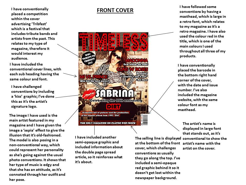
Overall, I have included many conventional features that appear on a front cover of a music magazine, however I've also challenged conventions too. The font of my masthead relates to my magazine as it has quite an old-fashioned 'arcade' look, which gives the impression my magazine is retro. The image has a sepia effect, which also challenges conventions as my magazine is supposed to be about music from the past and the image is supposed to have been taken years ago, as it shows the artist at the height of her music career (in 1993). Obviously, photographs in 1993 weren't sepia, however I thought it gave the photo an eye-catching effect and reinforces that my magazine is about old music. The newspaper background gives the magazine a 'quirky' and different look, therefore I have challenged conventions by having an unusual background as I noticed during my research that most magazine front covers have a plain background. I've also made my font unconventional within my cover lines, as it looks like old 'cartoon' font, which I thought would look good as it resembles the mise en scene of my magazine.

I made the choice of picking this type of magazine as I'm interested in pop and rock bands from the past as they have influenced today's music. That kind of music is also very different compared to the music in today's charts, which is what I like. I chose the colours red, black and white as they would stand out if they were on the shelf; they are also simple colours and I think they contrast well together. I made the choice of having quite a 'grunge' style (with the model's clothes) because I thought it would be different compared to some magazines that are on the market, such as Q and NME as they are mainly indie.

If I were to do my front cover again, I would maybe add more cover lines to make it look more conventional. I might add more pictures to the front cover to show what else is featured in the magazine. I might also make the magazine have a more specific audience instead of a diverse one, as my audience is unconventionally diverse because even though the audience is mainly young people, older people would probably be interested in it due to the music that is featured being from when they were younger. However, I think that this would broaden the audience therefore the magazine would sell more copies if it appeals to more than one audience.

My initial ideas were very basic (my hand drawn draft on the left) and I was struggling to come up with a title. However, I like how the name 'Timeless' represents my magazine, as my magazine includes music that has been around for years. I also kept changing my mind about where to place things on the front cover, but overall I'm happy with the layout of my final cover. 
I kept changing my mind about the layout and also the colours. As you can see by one of my many drafts on the right, I changed to dark blue at one point, as I thought that my cover was 'too boring' in terms of colour. However, I realised that simple colours are sometimes best, as that way it doesn't look too messy and colourful as I wanted a simple house style theme to run throughout my products. I was convinced that the image on the left was my final front cover, but after receiving feedback, I knew I had to improve.

I received teacher feedback and acted on the feedback by making the masthead bigger and adding a graphic behind it, as it didn't look professional seeing the newspaper background through the 'dotty' font. I also changed the slanted information below 'Sabrina' as it didn't look that conventional and my teacher said that I needed to put another graphic behind the text, as it seemed to 'get lost' within the background. I also received peer feedback from my classmates, in which they said that it might look better if I space my text out more as it looked crowded.

I then came up with this draft (on the left). I acted on my feedback previously and made the masthead bigger and also changed the font of my cover lines. I also added a semi-opaque pale red graphic behind the selling line along the bottom and behind the information (now horizontal) below 'Sabrina'. I also moved my bar code further to the right and added the price to it, as I realised that was more conventional.
I received feedback again, in which they suggested to move my plug line further up and make it smaller, remove one of the pale red boxes below 'Sabrina' and move some of the text down. Also, I realised that the black background behind my masthead made it look too 'solid' so I made some more changes.

The changes made resulted in my final front cover (on the right). Overall, I'm pleased with how it turned out and the feedback that I received from it. I made the black background behind the masthead more opaque and made my plug smaller and moved it further up. I also moved some of the text further down so it was below 'Sabrina' and also removed one of the pale red boxes. I'm very pleased with how my front cover turned out.

Evaluation: Basic 300 Word Description


In what ways does your media product use, develop or challenge forms and conventions of real media products?


I have used continuity throughout my three products by creating a house style. I have used the same font throughout each product; the font displaying the cover lines on the front cover is used on the contents page to display the page numbers. I have also used the same colour scheme; red, white and black as it makes all three products look like they belong together. The competition on the front cover is included in the contents page with a picture to create anchorage. I used the same artist on all three products to create continuity as that way the reader knows what they are paying for. My layout on my front cover matches typical conventions of a magazine as I have included a masthead, cover lines, a bar code and a plug line. My contents page includes page numbers, a box layout and different sub headings to present each area of the magazine. My double page spread includes columns, a drop cap and pull quotes that the text wraps around in order to look conventional. The layout of my front cover challenges conventions as the selling line is along the bottom, instead of conventionally at the top. Also, I have used semi-opaque, red boxes which challenges conventions as it's different and the contrast of red with the black and white helps the magazine stand out if it was on the shelf. The artist in the magazine has the same outfit on but a different pose in all three products to show continuity and consistency. The name of the magazine 'Timeless' is displayed on the contents page in a website in order to link back to the front cover, in the same colour font. All three products include similar font, colours and pictures in order to look like the same magazine.

Sunday, 3 March 2013

Saturday, 2 March 2013

Final Double Page Spread


This is my final double page spread. As you can see, I have changed the picture (which is the one I edited in Photoshop before). I have also added photo credits to the bottom of the image as that is conventionally what magazines include. I have added the artist's name on the right hand page at the top and underneath I have included a stand first, which introduces the artist; I started the paragraph with a drop cap, as that is also conventional. I have also added a page number to the bottom of the right page and the article text 'wraps' around the pull quotes.