Thursday, 29 November 2012

My Images Taken


(The 'Prezi' above shows the variety of images I have taken of Sabrina, my main artist for my music magazine)


Other Images

 These images I took are for my contents page. I like the lighting on these images; I used a combination of studio lights and natural sunlight on the photo on the left, as it gives a slight sepia effect. I used studio lights alone on the photo on the right with the newspaper background. I like the second image especially as the combination of the David Bowie Tshirt, the white tutu skirt and diamante headband make her look like she's an 80s pop princess, which reinforces the genre and era of my magazine. The sunglasses also have a Cyndi Lauper style to them.

 The photo on the left was taken at a concert and I will use this image on my contents page to advertise a festival.

Thursday, 22 November 2012

Planning: Developing Ideas

As you can see from the process of my hand drawn drafts, to my box plans and then digital mock-ups, my ideas in the creative process of making a magazine keep changing. I'm constantly rearranging the layout of how I want my magazine to look and I will continue to do so until I get it how I want it to look.

The main colours I think I'm going to use are red, white and black as they are simple colours which will compliment each other when arranged a certain way. The idea that I have in mind for my magazine is going to be different to those on the market as my audience will be diverse and also the things that my magazine will include i.e the genre and era of music my magazine will be looking at. I want my magazine to be very different to those on the market and will hopefully fulfill the needs of people with similar music taste to me; pop and rock artists from the past 50 years.

Sunday, 18 November 2012

Digital Mock-ups

This is a digital mock-up draft for the front cover of my magazine, using Google images. I'd like the image to take up the full front cover, as that's what is conventional for a magazine. I'd have the conventional masthead at the top of the cover, I'd then have the artist or band name in the middle with the main cover line underneath, which would probably be a pull quote as it would then appeal to the audience, especially if it's what they have said - if it's outrageous, then it'd make people buy the magazine. Because my magazine is classic pop and rock (from past decades) I'd have the artist or band on the front wearing clothes from that era. My magazine will include a wide variety of different bands and artists, so it has a diverse audience.


This is a digital mock-up draft for the contents page of my magazine, using Google images. I'd have the conventional 'Contents' title at the top and underneath I'd have the name of the magazine 'Classix'. I'd have a large image to the left of the main artist from the cover, with the features of the magazine next to it, with the list of the pages. At the bottom, I'd have an album review and an advertisement of the competition from the cover of the magazine. I'd have a subscription advertisement running along the bottom as well, as a form of persuasion.


This is a digital mock-up draft for the double page spread of my magazine, using Google images. My initial ideas are that I will have a large image on the left hand side and the text on the right, as that is conventional for magazine articles. The title will go on the left too, above the image and a pull quote will go lower down, as it's a persuasive message for people to read it. I will have a stand first/sub-heading at the top on the right, just before the article. The interview will go in columns on the right too with pull quotes in between some of the paragraphs.

Wednesday, 14 November 2012

Box Plan Drafts

Here is a basic box plan of my front cover. I have included many conventional features, such as a masthead, a selling line at the top and cover lines to the left and right of the image. I've also included a pull quote, which will come from the double page spread article and a plug to the bottom left hand corner, which will be a competition. I've also included a bar code in the bottom right hand corner, which will include the date of the issue, the number of the issue and the price, as well as the website of the magazine. The image will conventionally take up most of the front cover and I will place cover lines and text over the image.


Here is a basic box plan of my contents page. I have included the conventional 'contents' title, along with the name of the magazine beside it and also the issue number. I will place an image of the main artist from my cover to the left, underneath the masthead, along with a pull quote from the article so it persuades the reader to turn to that page. I will include the conventional publication details below the image also. My page numbers will be on the right of the contents page, beside the list of pages listing what is in the magazine. Below that, I will place another image of a concert/festival, which would advertise the competition plug from the front cover. In the bottom left hand corner, I will place an album review, along with an image, of an artist that has been around for decades if they have released a new album. The overall layout will be in a box format, so that it looks visually compelling and structured.

Here is a basic box plan of my double page spread. I will conventionally place the image of my main artist on the left, so that it takes up the full left hand side. I will have the name of the artist at the top, followed by a pull quote underneath, so that it makes the reader want to read on. I will include the publication details at the bottom and on the right page, I will begin with an opening introductory paragraph. I will have the article run in columns alongside each other, as that is conventionally how articles are displayed in magazines. I will include small pull quotes between some of the paragraphs and have the text 'wrap' around them; this gives the reader a quick overview of what the artist is saying within the article.

Thursday, 8 November 2012

Hand Drawn Drafts

Front Cover
Here is a brief hand drawn draft of my initial ideas for the front cover. As you can see, I have included the conventional masthead at the top and I have sketched out my first ideas for the layout. I have placed the price at the top in the left hand corner and underneath the masthead I have included a plug line, which will probably be a competition. I will have a large image that takes up the full page, with cover lines overlapping that image as when I was researching, I found that most magazines have cover lines that overlap the image. I will place the artist's name over the image and will include a selling line running along the bottom, which challenges conventions as I have found that usually selling lines run along the top.


Contents Page
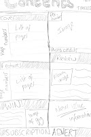
Here is a brief hand drawn draft of my initial ideas for the contents page. I've included the conventional 'contents' title, along with the name of the magazine. I sketched out a box layout as that way it looks more structured, with subheadings and page numbers placed along the left. I've also included a subscription advertisement along the bottom as I found when I was researching that magazines tend to place an advert within their contents page, encouraging their readers to subscribe. I'll also place an image of the main artist on the contents page, so it shows continuity.


Double Page Spread
Here is a brief hand drawn draft of my initial ideas for the double page spread of my magazine. I will place the image on the left page and have the article on the right, as when I was researching I found that it was conventional. I'll place my text in columns and have pull quotes within, as it creates a shortcut for the reader so they get a quick overview of what kind of things the artist is talking about within the article. I will place photo credits under the image and place a stand first at the top of the right hand page, with a drop cap as I found that was conventional.

Tuesday, 6 November 2012

Style Inspirations

Madonna and Cyndi Lauper are my inspirations for my artist on the front cover. Their vintage style in these photos is what I want to get across with my model on the cover. I will have my model's hair curly and her make up dark, so it gives her a slight grunge, edgy look, like Madonna. <<
Her outfit will also consist of black and white; I want quite unique clothing. The ideas that I have in mind include quite dark clothing with a unique print and sunglasses, so that she looks like a pop star. I think I will have my model look like she's from the 90s, therefore the photo will have been taken 20 years ago, so the outfit must be slightly out of fashion compared to now.


This is the kind of style I'll be going for. I want a slight grunge looking artist that was around in the 1990s. My model will have this kind of look.

Monday, 5 November 2012

Brief Initial Ideas

Here are a few brief ideas of what I'd like my magazine to look like. I'd want a house style with simple colours, so as not to confuse the reader. In order for my magazine to appeal to both male and female, I will use appropriate colours. I'd want the name of my magazine to resemble the genre, therefore my favourite name so far is 'Timeless' because it describes the music that my magazine would include; music that is still popular today. I'd also include artists from the past and make my artist on the front cover look like she's from the 80s; I will do this by having my model wear 'wild' clothing and make the outfit look retro. I'd also want my font to resemble the genre, therefore I will have the masthead in an 'arcade' type font, so that it looks retro. I will also make my cover lines have a cartoon type font, so that it reflects the fun, quirky style of my magazine. I will make sure the setting of the photoshoot links to the genre of my magazine; I'm thinking that I could maybe have a black and white background, with newspaper, or against a brick wall as they are unique settings. I will make sure the mise en scene links to the type of magazine I'm going for so that it looks professional. I will use studio lights also for the same reason.

Sunday, 4 November 2012

Existing Magazines: Price & Publication

The price of the magazine should depend on what your target audience would be able to afford and how often it would be published. If the audience is further up the social grade and are older, the magazine should be more expensive. However, if the audience is further down the social grade and are teenagers, then the magazine should be cheaper due to what they can afford, as most teenagers don't have jobs as they're in full time education.


Saturday, 3 November 2012

Audience Research: Q&A

Q&A Music Mag Research by Zoe Oglesby on GoAnimate

Animation Software - Powered by GoAnimate.

I asked these questions to some students and decided to present the conversation as a 'GoAnimate' animation. The responses I got helped me understand what my target audience would prefer and what price they'd be willing to pay.

Here is another questionnaire I did to find out what about the music magazine I am hoping to make; I asked 10 males and 10 females, to make it fair.


Questionnaire:
1. What kind of music do you prefer?
Pop: 8
Rock: 6
R&B: 4
Other: 2
2. Which is your favourite era of music?
Now: 6
90s: 5
80s: 7
Other: 2
3. How often do you buy music magazines?
Weekly: 4
Monthly: 8
Sometimes: 4
Never: 4
4. Would you buy a music magazine, if it came out weekly at £3 about old music?
Yes: 10
No: 4
Maybe: 6

Friday, 2 November 2012

Audience: Psychographics

My music magazine will be aimed at a target audience of people with similar interests, attitudes and opinions. My magazine will appeal to particular groups depending on their personalities, values, attitudes, interests or lifestyle.

Early psychographic research described consumers or audience members on the basis of psychological characteristics usually gathered from standardised questionnaires.

There were four main categories, which were subdivided into nine different lifestyles:

·         Groups driven by needs: - survivors and sustainers

·         Groups who are outer-directed: belongers, emulators, and achievers

·         Groups who are inner-directed: I-am-me, experientals, societally conscious

·         Groups who are outer and inner-directed: integrated

Maslow’s Hierarchy Of Needs

Maslow’s model requires that we fulfil one level, before we can move onto the next.

My magazine will be aimed at people who appreciate all genres and eras of music that have been produced throughout the decades. The group that my audience would go in would be the inner-directed category, as instead of listening to chart music like most teenagers they would prefer to listen to music that has been around for a longer amount of time. However, they might still enjoy today’s music, but appreciate that it has evolved from music from the past.
I think my audience would belong in the ‘safety’ part of Maslow’s Hierarchy of Needs, as my audience would prefer old music rather than new music, which is going against the stereotypical music that teenagers like, therefore they wouldn’t belong in the ‘social’ part.

Audience: Demographics


Explains my target audience in detail.