Here is a brief hand drawn draft of my initial ideas for the front cover. As you can see, I have included the conventional masthead at the top and I have sketched out my first ideas for the layout. I have placed the price at the top in the left hand corner and underneath the masthead I have included a plug line, which will probably be a competition. I will have a large image that takes up the full page, with cover lines overlapping that image as when I was researching, I found that most magazines have cover lines that overlap the image. I will place the artist's name over the image and will include a selling line running along the bottom, which challenges conventions as I have found that usually selling lines run along the top.
Contents Page
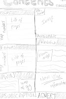
Here is a brief hand drawn draft of my initial ideas for the contents page. I've included the conventional 'contents' title, along with the name of the magazine. I sketched out a box layout as that way it looks more structured, with subheadings and page numbers placed along the left. I've also included a subscription advertisement along the bottom as I found when I was researching that magazines tend to place an advert within their contents page, encouraging their readers to subscribe. I'll also place an image of the main artist on the contents page, so it shows continuity.
Double Page Spread
Here is a brief hand drawn draft of my initial ideas for the double page spread of my magazine. I will place the image on the left page and have the article on the right, as when I was researching I found that it was conventional. I'll place my text in columns and have pull quotes within, as it creates a shortcut for the reader so they get a quick overview of what kind of things the artist is talking about within the article. I will place photo credits under the image and place a stand first at the top of the right hand page, with a drop cap as I found that was conventional.


No comments:
Post a Comment