
Wednesday, 19 December 2012
Final Front Cover
Tuesday, 18 December 2012
Feedback: Front Cover
Teacher
- Make your plug higher so it's in the upper left hand corner
- You only need one of those stories along the bottom, get rid of the 'an interview with....'
- Make the box 'a time line full...' more of a box and place it below the kiss so its a side feature still within the pale red box.
- Because you are removing one red box you can move your main story down a little so the 'celebrating the 20th...' is easier to see.
Peer
Front cover masthead might look better if the black background was opaque, or maybe without black background but instead filling in the dots in black.
I will make some more changes to my front cover based on this feedback. I will make my plug higher and get rid of one of the pale red boxes. I will also move the text about 'Sabrina' down slightly. Also, I'm going to change the masthead as I realised that it looks too 'solid', therefore I will act on my peer feedback and improve the visual quality.
Front Cover Draft 5

Monday, 17 December 2012
Peer Feedback (Blog & Front Cover)
I have taken into account what everyone has said and I'm willing to make changes to improve. I'm going to maybe make my price smaller, space things out more and make the artist's name stand out more. This way, it will improve my magazine as feedback is very important. I'm glad everyone liked my front cover in general though.
Front Cover Teacher Feedback
Drafts: 4 submitted - all quite good.
Draft 4 is the best so far I think
- You need to put a graphic behind your masthead, as the 'dotty' font is
nice but gets a bit lost amongst the newspaper background. Also, consider making
the masthead a bit 'deeper' - as it's supposed to occupy roughly 1/5 of the
page.
- Consider adding a teasing contents graphic along the bottom of your page
(behind the 'the only . . .').
- Your barcode needs some work in order to make it look professional. Move
it further to the right and add the date and price.
- The cover lines are in urgent need of some attention. They don't work on a
slant underneath Sabrina. You might have to consider using semi-opaque graphics
behind every bit of text because of the background.
My Response to Feedback:
I am willing to make improvements in order for my magazine to look better. I will change the layout around and add semi-opaque graphics behind most of the text, as I understand that it doesn't stand out because of the newspaper background. I will also make my masthead much bigger because now that I look at it from a different perspective, I can see that it's too small and doesn't stand out because of the background.
Sunday, 16 December 2012
Front Cover Draft 4
 This is my fourth draft as I decided I needed to change a few things. I made the text near to the bottom go in a diagonal as it makes the cover look more interesting and it also goes against conventions, which would make my magazine different and unique; I also changed the cover lines back to red as I think it looks better that way as it's more neat and the colours go better together. I moved the price near to the top and the selling line at the bottom again. I also moved the competition plug line near to the top as it stands out more there.
Front Cover Draft 3
 This is my third draft and this time I decided to change some of the colours to make it look more interesting, instead of just plain colours. I changed the cover lines to dark blue as it makes the front cover look more exciting and stands out more because of the variety of colour.
Front Cover Draft 2

Front Cover Draft 1
 This is my first front cover draft. As you can see, I have used similar colours throughout; red, white and black. This way, it looks properly structured and easy to read. I chose that type of font for my masthead as it reinforces my type of magazine i.e music from the past; the old arcade type font seemed appropriate and I thought it looked good with the sepia effect of the background, which also makes my magazine have an old fashioned theme. I chose this picture as it connotes her genre; the pose with her tongue out gives the impression that she has a rebellious nature and is willing to go against conventions of posing for a photo, so her type of music would be quite edgy. I used similar colours and font throughout my cover to create a house style.
Thursday, 6 December 2012


Thursday, 29 November 2012
My Images Taken
(The 'Prezi' above shows the variety of images I have taken of Sabrina, my main artist for my music magazine)
Other Images

 These images I took are for my contents page. I like the lighting on these images; I used a combination of studio lights and natural sunlight on the photo on the left, as it gives a slight sepia effect. I used studio lights alone on the photo on the right with the newspaper background. I like the second image especially as the combination of the David Bowie Tshirt, the white tutu skirt and diamante headband make her look like she's an 80s pop princess, which reinforces the genre and era of my magazine. The sunglasses also have a Cyndi Lauper style to them.
Thursday, 22 November 2012
Planning: Developing Ideas
As you can see from the process of my hand drawn drafts, to my box plans and then digital mock-ups, my ideas in the creative process of making a magazine keep changing. I'm constantly rearranging the layout of how I want my magazine to look and I will continue to do so until I get it how I want it to look.
The main colours I think I'm going to use are red, white and black as they are simple colours which will compliment each other when arranged a certain way. The idea that I have in mind for my magazine is going to be different to those on the market as my audience will be diverse and also the things that my magazine will include i.e the genre and era of music my magazine will be looking at. I want my magazine to be very different to those on the market and will hopefully fulfill the needs of people with similar music taste to me; pop and rock artists from the past 50 years.
The main colours I think I'm going to use are red, white and black as they are simple colours which will compliment each other when arranged a certain way. The idea that I have in mind for my magazine is going to be different to those on the market as my audience will be diverse and also the things that my magazine will include i.e the genre and era of music my magazine will be looking at. I want my magazine to be very different to those on the market and will hopefully fulfill the needs of people with similar music taste to me; pop and rock artists from the past 50 years.
Sunday, 18 November 2012
Digital Mock-ups


Wednesday, 14 November 2012
Box Plan Drafts

 Here is a basic box plan of my contents page. I have included the conventional 'contents' title, along with the name of the magazine beside it and also the issue number. I will place an image of the main artist from my cover to the left, underneath the masthead, along with a pull quote from the article so it persuades the reader to turn to that page. I will include the conventional publication details below the image also. My page numbers will be on the right of the contents page, beside the list of pages listing what is in the magazine. Below that, I will place another image of a concert/festival, which would advertise the competition plug from the front cover. In the bottom left hand corner, I will place an album review, along with an image, of an artist that has been around for decades if they have released a new album. The overall layout will be in a box format, so that it looks visually compelling and structured.
Thursday, 8 November 2012
Hand Drawn Drafts

Here is a brief hand drawn draft of my initial ideas for the front cover. As you can see, I have included the conventional masthead at the top and I have sketched out my first ideas for the layout. I have placed the price at the top in the left hand corner and underneath the masthead I have included a plug line, which will probably be a competition. I will have a large image that takes up the full page, with cover lines overlapping that image as when I was researching, I found that most magazines have cover lines that overlap the image. I will place the artist's name over the image and will include a selling line running along the bottom, which challenges conventions as I have found that usually selling lines run along the top.

Contents Page
Here is a brief hand drawn draft of my initial ideas for the contents page. I've included the conventional 'contents' title, along with the name of the magazine. I sketched out a box layout as that way it looks more structured, with subheadings and page numbers placed along the left. I've also included a subscription advertisement along the bottom as I found when I was researching that magazines tend to place an advert within their contents page, encouraging their readers to subscribe. I'll also place an image of the main artist on the contents page, so it shows continuity.
 Double Page Spread
Here is a brief hand drawn draft of my initial ideas for the double page spread of my magazine. I will place the image on the left page and have the article on the right, as when I was researching I found that it was conventional. I'll place my text in columns and have pull quotes within, as it creates a shortcut for the reader so they get a quick overview of what kind of things the artist is talking about within the article. I will place photo credits under the image and place a stand first at the top of the right hand page, with a drop cap as I found that was conventional.

Here is a brief hand drawn draft of my initial ideas for the double page spread of my magazine. I will place the image on the left page and have the article on the right, as when I was researching I found that it was conventional. I'll place my text in columns and have pull quotes within, as it creates a shortcut for the reader so they get a quick overview of what kind of things the artist is talking about within the article. I will place photo credits under the image and place a stand first at the top of the right hand page, with a drop cap as I found that was conventional.
Tuesday, 6 November 2012
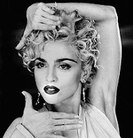
Style Inspirations

 Madonna and Cyndi Lauper are my inspirations for my artist on the front cover. Their vintage style in these photos is what I want to get across with my model on the cover. I will have my model's hair curly and her make up dark, so it gives her a slight grunge, edgy look, like Madonna. <<
Her outfit will also consist of black and white; I want quite unique clothing. The ideas that I have in mind include quite dark clothing with a unique print and sunglasses, so that she looks like a pop star. I think I will have my model look like she's from the 90s, therefore the photo will have been taken 20 years ago, so the outfit must be slightly out of fashion compared to now.
This is the kind of style I'll be going for. I want a slight grunge looking artist that was around in the 1990s. My model will have this kind of look.
Monday, 5 November 2012
Brief Initial Ideas

Here are a few brief ideas of what I'd like my magazine to look like. I'd want a house style with simple colours, so as not to confuse the reader. In order for my magazine to appeal to both male and female, I will use appropriate colours. I'd want the name of my magazine to resemble the genre, therefore my favourite name so far is 'Timeless' because it describes the music that my magazine would include; music that is still popular today. I'd also include artists from the past and make my artist on the front cover look like she's from the 80s; I will do this by having my model wear 'wild' clothing and make the outfit look retro. I'd also want my font to resemble the genre, therefore I will have the masthead in an 'arcade' type font, so that it looks retro. I will also make my cover lines have a cartoon type font, so that it reflects the fun, quirky style of my magazine. I will make sure the setting of the photoshoot links to the genre of my magazine; I'm thinking that I could maybe have a black and white background, with newspaper, or against a brick wall as they are unique settings. I will make sure the mise en scene links to the type of magazine I'm going for so that it looks professional. I will use studio lights also for the same reason.
Sunday, 4 November 2012
Existing Magazines: Price & Publication
The price of the magazine should depend on what your target audience would be able to afford and how often it would be published. If the audience is further up the social grade and are older, the magazine should be more expensive. However, if the audience is further down the social grade and are teenagers, then the magazine should be cheaper due to what they can afford, as most teenagers don't have jobs as they're in full time education.


Saturday, 3 November 2012
Audience Research: Q&A
Q&A Music Mag Research by Zoe Oglesby on GoAnimate
Animation Software - Powered by GoAnimate.
I asked these questions to some students and decided to present the conversation as a 'GoAnimate' animation. The responses I got helped me understand what my target audience would prefer and what price they'd be willing to pay.
Here is another questionnaire I did to find out what about the music magazine I am hoping to make; I asked 10 males and 10 females, to make it fair.
Questionnaire:
1. What kind of music do you prefer?
Pop: 8
Rock: 6
R&B: 4
Other: 2
2. Which is your favourite era of music?
Now: 6
90s: 5
80s: 7
Other: 2
3. How often do you buy music magazines?
Weekly: 4
Monthly: 8
Sometimes: 4
Never: 4
4. Would you buy a music magazine, if it came out weekly at £3 about old music?
Yes: 10
No: 4
Maybe: 6
Friday, 2 November 2012
Audience: Psychographics
My music magazine will be aimed at a target audience of people with similar interests, attitudes and opinions. My magazine will appeal to particular groups depending on their personalities, values, attitudes, interests or lifestyle.

Early psychographic research described consumers or audience members on the basis of psychological characteristics usually gathered from standardised questionnaires.
There were four main categories, which were subdivided into nine different lifestyles:
· Groups driven by needs: - survivors and sustainers
· Groups who are outer-directed: belongers, emulators, and achievers
· Groups who are inner-directed: I-am-me, experientals, societally conscious
· Groups who are outer and inner-directed: integrated
Maslow’s Hierarchy Of Needs
Maslow’s model requires that we fulfil one level, before we can move onto the next.

My magazine will be aimed at people who appreciate all genres and eras of music that have been produced throughout the decades. The group that my audience would go in would be the inner-directed category, as instead of listening to chart music like most teenagers they would prefer to listen to music that has been around for a longer amount of time. However, they might still enjoy today’s music, but appreciate that it has evolved from music from the past.
I think my audience would belong in the ‘safety’ part of Maslow’s Hierarchy of Needs, as my audience would prefer old music rather than new music, which is going against the stereotypical music that teenagers like, therefore they wouldn’t belong in the ‘social’ part.
Tuesday, 30 October 2012
Audience Research: Reader Profiles
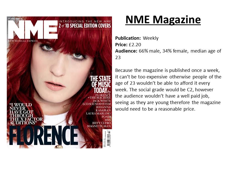
Reader profiles are very useful in order to gather information about the audience i.e the amount of males and females, the median age and the type of things the audience are interested in. Here's an example of NME's reader profile.
http://www.ipcadvertising.com/resource/6dcz2moj66wp0swdpyx5rv3o.pdf

http://www.ipcadvertising.com/resource/6dcz2moj66wp0swdpyx5rv3o.pdf
My Reader Profile:

My reader profile is similar to the example of NME's, mentioned above. I have included pictures of my audience's interests, such as:
- An Ipod Classic, as even though they aren't the newest model, they have a large memory suitable for storing the music that my audience would be interested in, the different genres and the different time zones of which the music is from.
- Models displaying clothes from Topshop, as they are known for selling quite vintage clothes, which is very popular with young people today.
- Gadgets such as a laptop, Playstation 3 and a camera as young people are known for having the latest gadgets
- Other things, such as clothes, shoes, chocolate and alcohol, which is very popular with young people.
I have included items that would appeal to the male audience as well as the female audience as the magazine would appeal to both. The reason my median age is 24 is because even though mainly young people would buy the magazine (teenagers), older people would sometimes buy it if they recognise who is on the front cover as it would be music they used to listen to when they were younger, therefore '24' would be the average age.
My target audience would be male and female; I think that more males would be interested in the classic rock part of the magazine and more females would be interested in the classic pop part, but mainly a mixture. The age group would vary; older people might like to read it as it would be music that they used to listen to when they were younger however, young people would also read it as many young people like old music and prefer it to current music. Overall, I think the average age appropriate for my magazine would be around 24 as that age is in between the younger audience and the older audience.
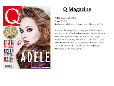
The magazine's price would be £2.99 as that way, the young audience can afford it, especially students. It'll be published once a month as because it's classic pop and rock, there aren't always going to be new updated music and stories within the magazine. However, because it's once a month, every issue could have a different classic rock band or artist on the front cover based on an anniversary, e.g. a well known album's 20th anniversary, or a certain artist's birthday month. I got the idea for my magazine from reading special editions of Q magazine and Smash Hits; when Michael Jackson died, Smash Hits produced a one-off special all about his music career. I enjoyed reading it and wanted them to make more of them type of magazines but with other artists from the past.
My target audience would be male and female; I think that more males would be interested in the classic rock part of the magazine and more females would be interested in the classic pop part, but mainly a mixture. The age group would vary; older people might like to read it as it would be music that they used to listen to when they were younger however, young people would also read it as many young people like old music and prefer it to current music. Overall, I think the average age appropriate for my magazine would be around 24 as that age is in between the younger audience and the older audience.
The magazine's price would be £2.99 as that way, the young audience can afford it, especially students. It'll be published once a month as because it's classic pop and rock, there aren't always going to be new updated music and stories within the magazine. However, because it's once a month, every issue could have a different classic rock band or artist on the front cover based on an anniversary, e.g. a well known album's 20th anniversary, or a certain artist's birthday month. I got the idea for my magazine from reading special editions of Q magazine and Smash Hits; when Michael Jackson died, Smash Hits produced a one-off special all about his music career. I enjoyed reading it and wanted them to make more of them type of magazines but with other artists from the past.
Monday, 29 October 2012
LIIAR Analysis: Double Page Spread

Again, most of the photos are in black and white and the members have long hair, which connotes their music genre as being rock. They are also wearing tight jeans and jewellery, as that’s what rock bands used to wear. The magazine also represents the band Aerosmith as being energetic and lively, like a typical rock band, as the photos of Steven Tyler (the main front man) involve him dancing on stage.
Sunday, 28 October 2012
LIIAR Analysis: Contents Page

The Rolling Stones are represented by a large image to the left of the text. Once again, it’s an image in black and white, which connotes the genre of rock as it’s usually seen as dark and loud music. People in rock bands aim to look a certain way; as if they have a “don’t care” attitude and that’s represented by the image as some of the members aren’t looking at the camera and look as though they weren’t ready for the photo.
Saturday, 27 October 2012
LIIAR Analysis: Front Cover
 The front page shows the rock band AC/DC and the
photo is composed to look like a conventional rock band photo as it's in black
and white. The darkness of the image connotes what their music is about; rock
is quite loud and outrageous and they're presented as outrageous by the way in
which they're going against the conventional way of posing for a photo. The
also have long hair and are pulling different faces; you can tell they're a
rock band by this photo because it's dark and the way in which they look as if
they weren't expecting a photo. If it was a pop band, it'd be a brighter photo
and they'd probably be dressed differently and all smiling. The masthead is in
capital letters; this could connote the idea that it's loud and is like it
shouts out at you, which could represent their music. The colour of it is
white, so it stands out against the dark background - this could connote that
the band stands out with their music. It's also in very large font, behind the
band, as to catch your eye and show what they are about. The cover portrays
many conventional features, such as a selling line at the top; this helps sell
the magazine as if it includes "4 free gifts" it'll make the audience
buy it. It also has the conventional name of the band towards the bottom of the
magazine in large font; this makes it stand out so you instantly know who the
band is. There are also cover lines at the bottom of the magazine to show
what's inside so that it persuades the audience to buy it. The front cover has the
typical "house style" running throughout with the colours red, black
and white; this makes it look less messy and doesn't confuse you when looking
at it. Another selling line is placed at the bottom; "10th birthday
special edition" - this would make the audience buy it as usually in
special editions, the magazine might include more inside and would be a rare,
special issue.
The front page shows the rock band AC/DC and the
photo is composed to look like a conventional rock band photo as it's in black
and white. The darkness of the image connotes what their music is about; rock
is quite loud and outrageous and they're presented as outrageous by the way in
which they're going against the conventional way of posing for a photo. The
also have long hair and are pulling different faces; you can tell they're a
rock band by this photo because it's dark and the way in which they look as if
they weren't expecting a photo. If it was a pop band, it'd be a brighter photo
and they'd probably be dressed differently and all smiling. The masthead is in
capital letters; this could connote the idea that it's loud and is like it
shouts out at you, which could represent their music. The colour of it is
white, so it stands out against the dark background - this could connote that
the band stands out with their music. It's also in very large font, behind the
band, as to catch your eye and show what they are about. The cover portrays
many conventional features, such as a selling line at the top; this helps sell
the magazine as if it includes "4 free gifts" it'll make the audience
buy it. It also has the conventional name of the band towards the bottom of the
magazine in large font; this makes it stand out so you instantly know who the
band is. There are also cover lines at the bottom of the magazine to show
what's inside so that it persuades the audience to buy it. The front cover has the
typical "house style" running throughout with the colours red, black
and white; this makes it look less messy and doesn't confuse you when looking
at it. Another selling line is placed at the bottom; "10th birthday
special edition" - this would make the audience buy it as usually in
special editions, the magazine might include more inside and would be a rare,
special issue."Classic Rock" is a British magazine, mainly focusing on rock bands from the 1960s to 1990s, however it also includes upcoming artists and reviews they think are suitable for the magazine. It started off as just a one-off special, however it soon became one of the UK's best selling music magazines. It has a higher circulation than 'NME', which shows that music from the past is still hugely popular in the present.
"The magazine attracted a niche audience initially but
sales grew as Classic Rock featured artists such as Black Sabbath,
Iron Maiden and Aerosmith on its cover in the first year. It
attracted those who saw mainstream music publications such as
'Q'' and 'NME' to be stale, and too focused on discovering the
next big thing."
It is
published by Future Publishing and it's the sixth largest media company in the
UK. It publishes more than 150 magazines in categories such as; video
games, films and photography etc. There is also a US version. Future Publishing
has become a large global company, so the fact that they produce this magazine
shows that it must be popular in order for them to produce it.
Source: Wikipedia
Source: Wikipedia
Rock
bands are conventionally presented as having no morals, as most of them are
known for drug and alcohol abuse. The front cover portrays the band AC/DC as
being the stereotypical rock band. The photo is in black and white, therefore
the darkness could symbolise their 'dark' behaviour; going to parties all of
the time and the usual "trashing hotel rooms". The way in which
they're all pulling different faces shows there were no rules involved in
the photo shoot, as it looks like there was no order to it; they're
all doing what they want to do. It shows that they are willing to go against
conventions and not take themselves too seriously, which makes them appeal to
their audience as that's generally what people like. Also, some of the band
members look moody, which makes them seem 'cool' and straight-faced. It
suggests that the audience could be teenagers who look up to them and you're
considered 'cool' if you like rebellious bands.
The
magazine suggests that the target audience would be those that try to be
like them, which is why people consider rock bands to be a bad influence. These
bands are considered 'cool' and people want to be like them so go out of their
way to break the rules and go against conventions. The target audience could
also be people who stick to the rules and have good morals, but look to these
bands for ways to be considered 'cooler' by their fellow peers, especially
teenagers. This magazine’s target audience would be mainly men, as rock is
conventionally seen to be a male type of music as it’s loud and considered ‘wild’.
I think it’d be a mixture of ages; teenagers, as they would look up to this
kind of music and might have been influenced and shown by their parents when they
were younger. Older people might also buy it, as they might have been a fan of
AC/DC’s music back when they were big.
AC/DC
are represented as being rebellious, as they are going against conventions in
terms of their poses in the photo and their behaviour, as you can barely see
some of the band members; this shows that there was no set way they had in mind
of taking the photo. You can tell straight away, even if you aren’t aware of
the band, that it’s representing rock music as it’s in black and white. If it
was pop music, the colour would be much brighter; the featured band/artist
would be wearing different clothes and posing differently. AC/DC are a
well-known band, therefore with them appearing on the front cover, it would
sell more copies.
Market Research: Existing Magazines


Front Cover Examples
All of these magazine front covers have a similar genre to what my magazine will be. The first one is called 'Classic Pop' and has a picture of the Pet Shop Boys on the front - they were big in the 1980s and that's the type of music my magazine will include. The middle one includes Axl Rose from the band Guns N' Roses, which are a classic rock band. However, the third magazine includes Madonna, a classic pop artist that has been around for a while, and shows that she is still around in the music industry and it might include her recent music. All three magazines have a conventional masthead, classic artists from the past and cover lines to persuade people to buy the magazine. The image takes up most of the front cover and the cover lines surround it. There are also selling lines on the front covers; the first one says 'new magazine' which would persuade people to buy it and the second has 'free CD' at the top of the magazine (free gifts would make people buy it).


Contents Page Examples
All three contents pages have page numbers but don't include the word 'page' as this is the conventional way in which contents pages are created. They all have big images or a few small images as this draws the reader in as they might like that particular band or artist. Pull quotes have also been used as anchorage to draw the reader in and want to read that particular article; e.g. the artist might have said something outrageous that would make the reader want to read more. The middle magazine also has a subscription advertisement. There's also a good use of sub-headings to create structure for the contents page. They also include things that were on the cover to make it easier for the reader to find inside the magazine. There are also captions, publication details and photo and stylist credit under or next to the main image on the contents page.

.jpg)

Double Page Spread Examples
Each double page spread is unique and creates interest for the readers who like these artists. The middle one has a large pull quote at the top, which would be the first thing the reader would read - this would make them want to read on in the article as it's quite outrageous. Each one has one large image on the left hand side of the double page spread; this creates an eye catching effect. At the start of each of the articles, the first letter is enlarged and in the main colour of the colour scheme that runs throughout, this is known as a drop-cap; this is known as 'house-style' and makes the article look structured and not messy. There are also captions on the image and picture information. On the third double page spread, there is extra information on the artist on the right; this gives variety within the article and usually tells you more about the artist/band.
Friday, 26 October 2012
Current Magazines: Circulation

As you can see, these four magazines represented in the pie chart above have a very high circulation in the UK. They are all similar genres to what my magazine would be, which demonstrates the amount of sales my magazine would probably make if they are producing this amount of copies.
The History Of My Genre
My magazine would include artists that were around mainly in the 60s, 70s, 80s and 90s; however, if an artist has released a new song then the magazine could be about what they're doing now.
Also, if a well known album's anniversary is coming up, the magazine would be about that. Many artists from the past are still making music today, such as Madonna, Kylie Minogue, Paul McCartney etc. Most music today is influenced from music in the 80s, as artists like Michael Jackson are still very popular with different generations and many artists today such as Justin Bieber, Justin Timberlake and Usher are influenced by him.
Legendary bands and artists from the past have made music what it is today, therefore Classic Pop and Rock is very important and this magazine would help younger generations understand more about the history of music.
 Madonna and Lady Gaga are very similar, which shows that Lady Gaga has been influenced by Madonna's style and type of music. They are both controversial and expressive artists and are known for their outrageous style and fast selling music.


Beyonce's inspiration is Tina Turner; they have similar types of music and also similar voices. When Beyonce was younger, she would have listened to Tina Turner as she was very popular in the 80s. She loved the way Tina Turner performed therefore performs in a similar way; Beyonce often sings ballads like Tina Turner.

 John Lennon is one of Liam Gallagher's inspirations, as he's a really big fan of his. When Liam was in the band Oasis, many of their songs were highly influenced by the Beatles. Liam Gallagher has said before in many interviews that he loves John Lennon's music and many of his songs are based on Lennon's.
Also, if a well known album's anniversary is coming up, the magazine would be about that. Many artists from the past are still making music today, such as Madonna, Kylie Minogue, Paul McCartney etc. Most music today is influenced from music in the 80s, as artists like Michael Jackson are still very popular with different generations and many artists today such as Justin Bieber, Justin Timberlake and Usher are influenced by him.
Legendary bands and artists from the past have made music what it is today, therefore Classic Pop and Rock is very important and this magazine would help younger generations understand more about the history of music.
PAST VS. PRESENT

 Madonna and Lady Gaga are very similar, which shows that Lady Gaga has been influenced by Madonna's style and type of music. They are both controversial and expressive artists and are known for their outrageous style and fast selling music.

Beyonce's inspiration is Tina Turner; they have similar types of music and also similar voices. When Beyonce was younger, she would have listened to Tina Turner as she was very popular in the 80s. She loved the way Tina Turner performed therefore performs in a similar way; Beyonce often sings ballads like Tina Turner.

 John Lennon is one of Liam Gallagher's inspirations, as he's a really big fan of his. When Liam was in the band Oasis, many of their songs were highly influenced by the Beatles. Liam Gallagher has said before in many interviews that he loves John Lennon's music and many of his songs are based on Lennon's.
Subscribe to:
Comments (Atom)